The card component
A grid where each element is a small card that displays a piece of data.
A grid where each element is a small card that displays a piece of data.
| name | required | type | description |
|---|---|---|---|
| columns | INTEGER |
The number of columns in the grid of cards. This is just a hint, the grid will adjust dynamically to the user's screen size, rendering fewer columns if needed to fit the contents. To control the size of cards individually, use the `width` row-level property instead. | |
| description | TEXT |
A short paragraph displayed below the title. | |
| description_md | TEXT |
A short paragraph displayed below the title - formatted using markdown. | |
| title | TEXT |
Text header at the top of the list of cards. |
| name | required | type | description |
|---|---|---|---|
| title | REQUIRED | TEXT |
Name of the card, displayed at the top. |
| active | BOOLEAN |
Whether this item in the grid is considered "active". Active items are displayed more prominently. | |
| background_color | The background color of the card. | ||
| class | TEXT |
class attribute added to the container in HTML. It can be used to apply custom styling to this item through css. Added in v0.18.0. | |
| color | The name of a color, to be displayed on the left of the card to highlight it. If the embed parameter is enabled and you don't have a title or description, this parameter won't apply. | ||
| description | TEXT |
The body of the card, where you put the main text contents of the card. This does not support rich text formatting, only plain text. If you want to use rich text formatting, use the `description_md` property instead. | |
| description_md | TEXT |
The body of the card, in Markdown format. This is useful if you want to display a lot of text in the card, with many options for formatting, such as line breaks, **bold**, *italics*, lists, #titles, [links](target.sql), , etc. | |
| embed | TEXT |
||
| embed_mode | TEXT |
||
| footer | TEXT |
Muted text to display at the bottom of the card. | |
| footer_link | URL |
An URL to which the user should be taken when they click on the footer. | |
| footer_md | TEXT |
Muted text to display at the bottom of the card, with rich text formatting in Markdown format. | |
| icon | Name of an icon to display on the left side of the card. | ||
| link | URL |
An URL to which the user should be taken when they click on the card. | |
| style | TEXT |
Inline style property to your iframe embed code. For example "background-color: #FFFFFF" | |
| top_image | URL |
The URL (absolute or relative) of an image to display at the top of the card. | |
| width | INTEGER |
The width of the card, between 1 (smallest) and 12 (full-width). The default width is 3, resulting in 4 cards per line. |
A beautiful card grid with bells and whistles, showing examples of SQLPage features.
select
    'card'                     as component,
    'Popular SQLPage features' as title,
    2                          as columns;
select
    'Download as spreadsheet'  as title,
    '?component=csv#component' as link,
    'Using the CSV component, you can download your data as a spreadsheet.' as description,
    'file-plus'                as icon,
    'green'                    as color,
    'SQLPage can both [read](?component=form#component) and [write](?component=csv#component) **CSV** files.' as footer_md;
select
    'Custom components'      as title,
    '/custom_components.sql' as link,
    'If you know some HTML, you can create your own components for your application.' as description,
    'code'                   as icon,
    'orange'                 as color,
'You can look at the [source of the official components](https://github.com/sqlpage/SQLPage/tree/main/sqlpage/templates) for inspiration.' as footer_md;You can use cards to display a dashboard with quick access to important information. Use markdown to format the text.
select
    'card' as component,
    4      as columns;
select
    '**152** sales today' as description_md,
    TRUE                  as active,
    'currency-euro'       as icon;
select
    '**13** new users' as description_md,
    'user-plus'        as icon,
    'green'            as color;
select
    '**2** complaints' as description_md,
    'alert-circle'     as icon,
    'danger'           as color,
    '?view_complaints' as link,
    'red-lt'           as background_color;
select
    '**1** pending support request' as description_md,
    'mail-question' as icon,
'warning' as color;A gallery of images.
select
    'card' as component,
    'My favorite animals in pictures' as title,
    3      as columns;
select
    'Lynx' as title,
    'The **lynx** is a medium-sized **wild cat** native to Northern, Central and Eastern Europe to Central Asia and Siberia, the Tibetan Plateau and the Himalayas.' as description_md,
    'https://upload.wikimedia.org/wikipedia/commons/thumb/d/d8/Lynx_lynx-4.JPG/640px-Lynx_lynx-4.JPG' as top_image,
    'star' as icon;
select
    'Squirrel' as title,
    'The **chipmunk** is a small, striped rodent of the family Sciuridae. Chipmunks are found in North America, with the exception of the Siberian chipmunk which is found primarily in Asia.' as description_md,
    'https://upload.wikimedia.org/wikipedia/commons/thumb/b/be/Tamias-rufus-001.jpg/640px-Tamias-rufus-001.jpg' as top_image;
select
    'Spider' as title,
    'The **jumping spider family** (_Salticidae_) contains more than 600 described genera and about *6000 described species*, making it the largest family of spiders with about 13% of all species.' as description_md,
    'https://upload.wikimedia.org/wikipedia/commons/thumb/a/ab/Jumping_spiders_%28Salticidae%29.jpg/640px-Jumping_spiders_%28Salticidae%29.jpg' as top_image;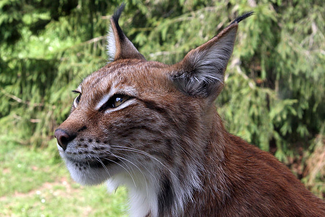
The lynx is a medium-sized wild cat native to Northern, Central and Eastern Europe to Central Asia and Siberia, the Tibetan Plateau and the Himalayas.

The chipmunk is a small, striped rodent of the family Sciuridae. Chipmunks are found in North America, with the exception of the Siberian chipmunk which is found primarily in Asia.

The jumping spider family (Salticidae) contains more than 600 described genera and about 6000 described species, making it the largest family of spiders with about 13% of all species.
Beautifully colored cards with variable width. The blue card (width 6) takes half the screen, whereas of the red and green cards have the default width of 3
select
    'card'                      as component,
    'Beautifully colored cards' as title;
select
    'Red card'              as title,
    'red'                   as color,
    'red-lt'                as background_color,
    'Penalty! You are out!' as description,
    'play-football'         as icon;
select
    'Blue card'     as title,
    'blue'          as color,
    6               as width,
    'blue-lt'       as background_color,
    'The Blue Card facilitates migration of foreigners to Europe.' as description,
    'currency-euro' as icon;
select
    'Green card'  as title,
    'green'       as color,
    'green-lt'    as background_color,
    'Welcome to the United States of America !' as description,
'user-dollar' as icon;Cards with remote content
select
    'card' as component,
    'Card with embedded remote content' as title,
    2      as columns;
select
    'Embedded Chart' as title,
    '/examples/chart.sql?_sqlpage_embed' as embed;
select
    'Embedded Video' as title,
    'https://www.youtube.com/embed/mXdgmSdaXkg' as embed,
    'accelerometer; autoplay; clipboard-write; encrypted-media; gyroscope; picture-in-picture; web-share' as allow,
    'iframe'         as embed_mode,
    '350'            as height;